
CASE STUDY • Frankie Turner • Wall's global "Mad For” campaign
Case Study
• • •
Case Study • • •
Frankie Turner and Flock partnered with Sunhouse to deliver photography and production for Wall's global "Mad For" campaign, creating a modular image library for international rollout.
When Wall's embarked on a major global brand refresh, the ambition was clear: create a unified visual identity capable of bringing together more than 40 ice cream brands under a single creative platform, while retaining the individuality and appeal of each product.
Partnering closely with the team at Sunhouse, photographer Frankie Turner, Flock and our wonderful team delivered a large-scale photographic campaign designed to support the launch of the new "Mad For" brand platform across international markets.
The team developed a robust photographic framework - a MODULAR IMAGE LIBRARY - that could flex seamlessly across outdoor, digital, social and retail channels while maintaining a consistent visual language throughout.
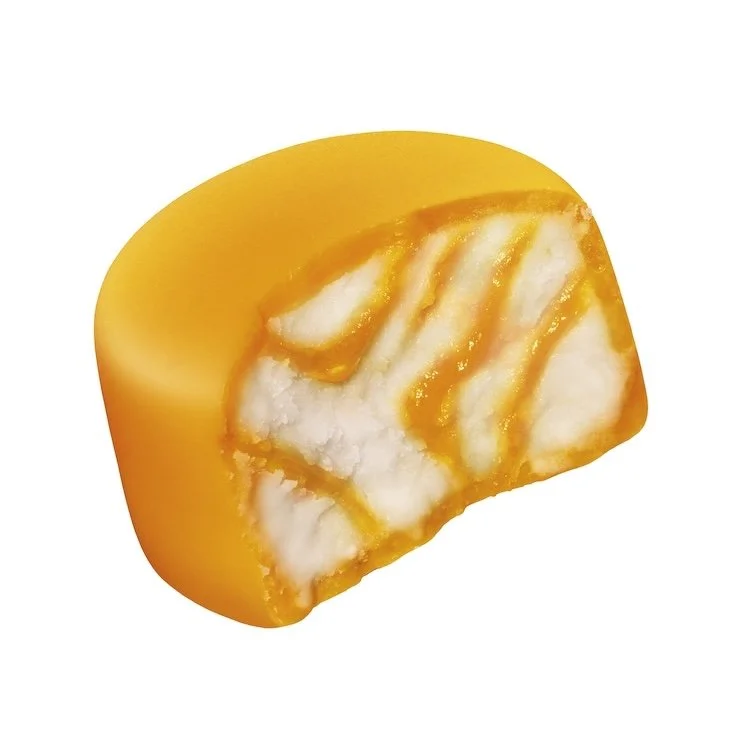
We helped bring a MEGA shot list full of bright photographic ambitions to life, capturing…
hero products
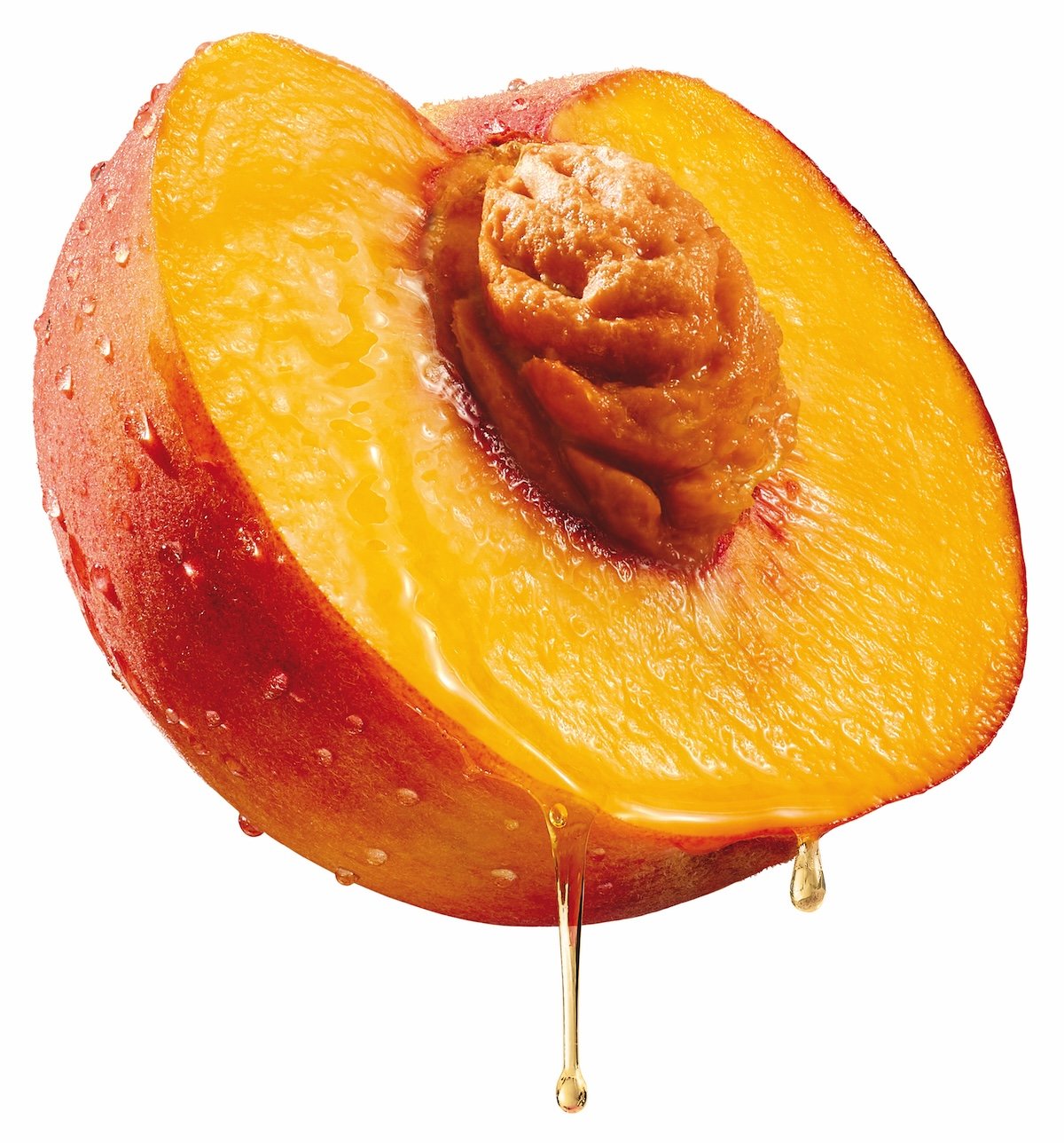
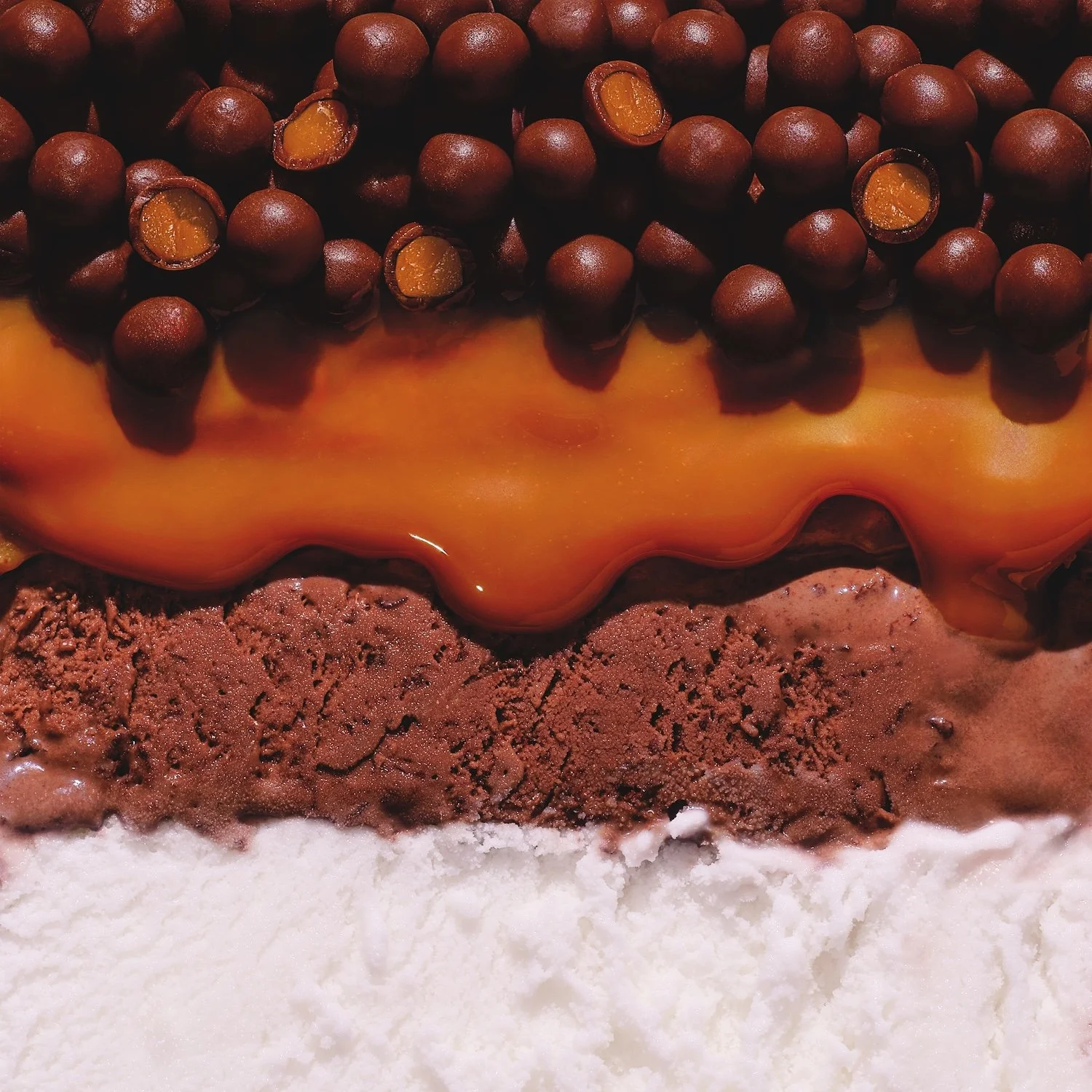
ingredient assets/flavour cues
packaging
lifestyle portraits
… resulting in a huge range of creative elements that could all be utilised in manifold different ways, with imagery that feels cohesive at a global level while remaining versatile enough to support a huge range of individual products and regional activations.
Frankie's photography brings vibrancy, energy and appetite appeal throughout the campaign, translating the playful spirit of the "Mad For" platform into imagery that feels beautifully captured and effortlessly engaging. From pre-production through to final delivery, the project needed a highly collaborative and agile approach, delivered with exceptional care and creative flexibility.

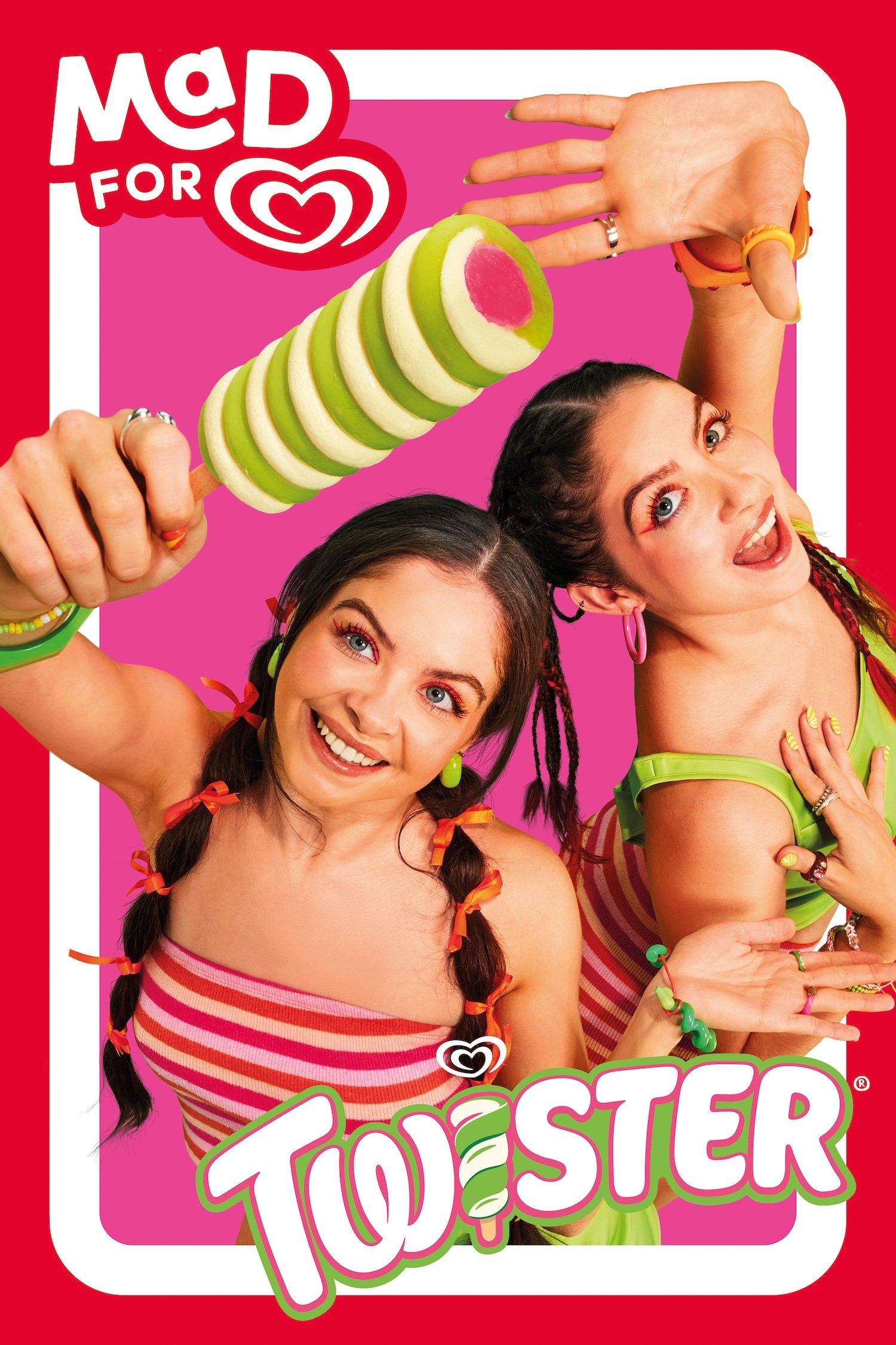


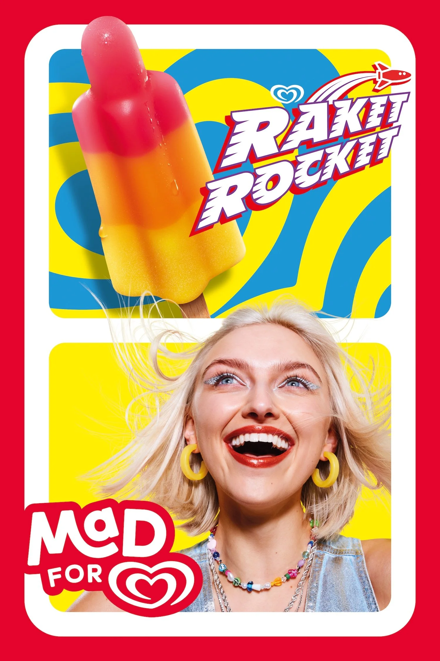


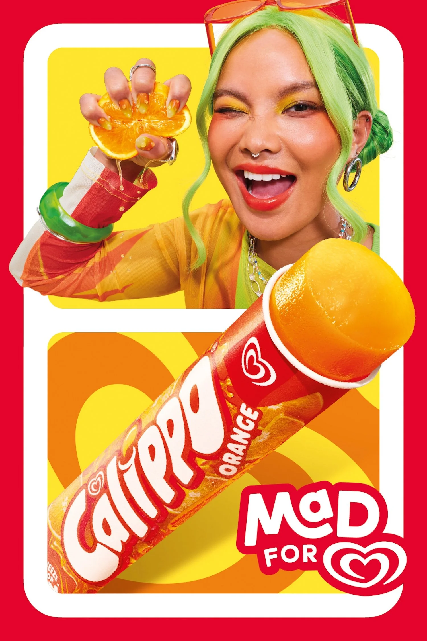
Frankie embodied the concept of being #madfor / deeply passionate about ice-cream throughout her photography - creating vibrant portraits that celebrate joy and anticipation, to complement heroic ice cream shots, focussing on ingredients alongside the “drips, melts and ooze” that are all part of an ice cream experience … an approach that allowed for endless flexibility and creativity.
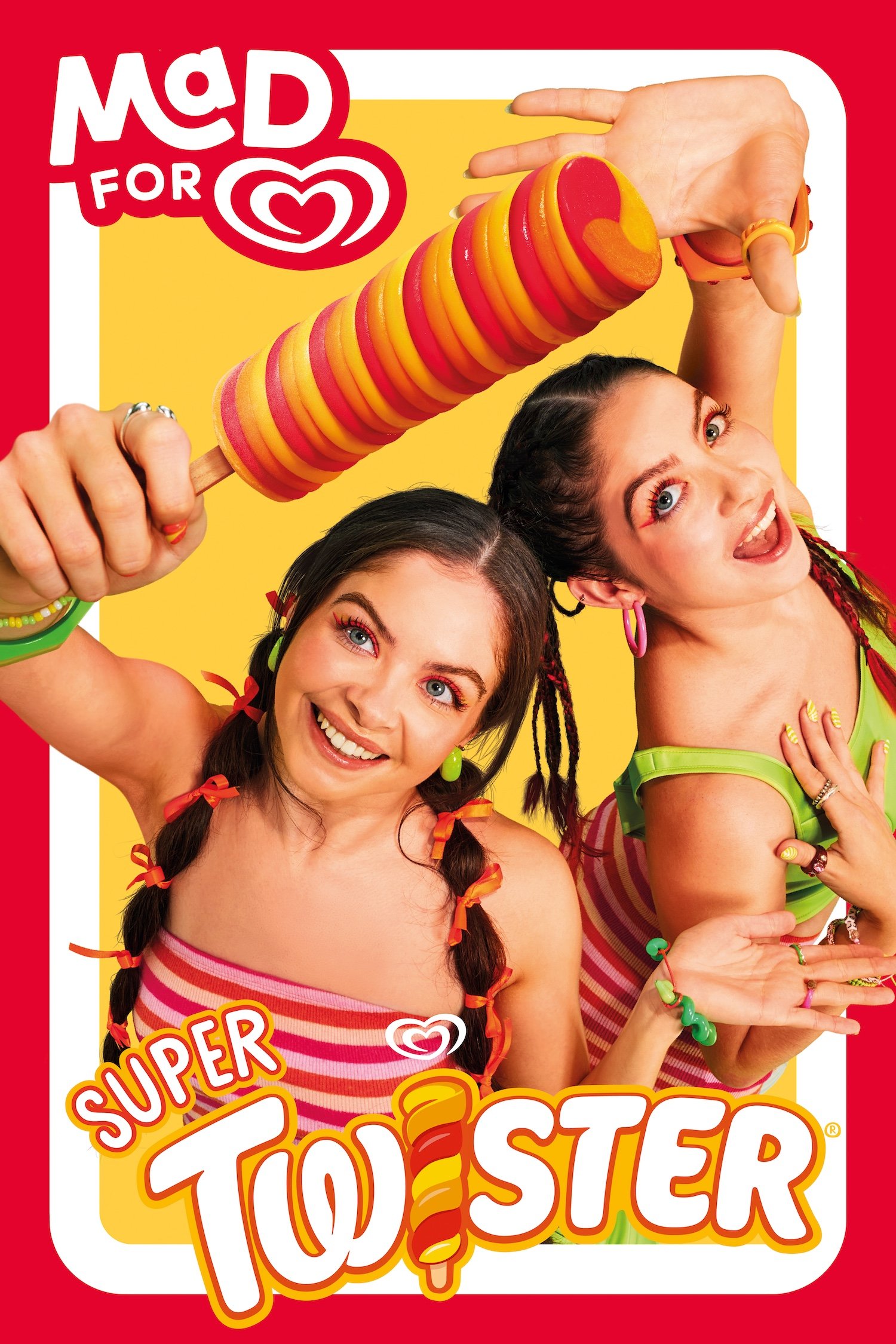
We cast an amazing array of actors for the key roles, ensuring each character could bring maximum energy, personality and life to the brand identity (including some gorgeously twisty, Twister twins👇!)
A few lovely outtakes below.


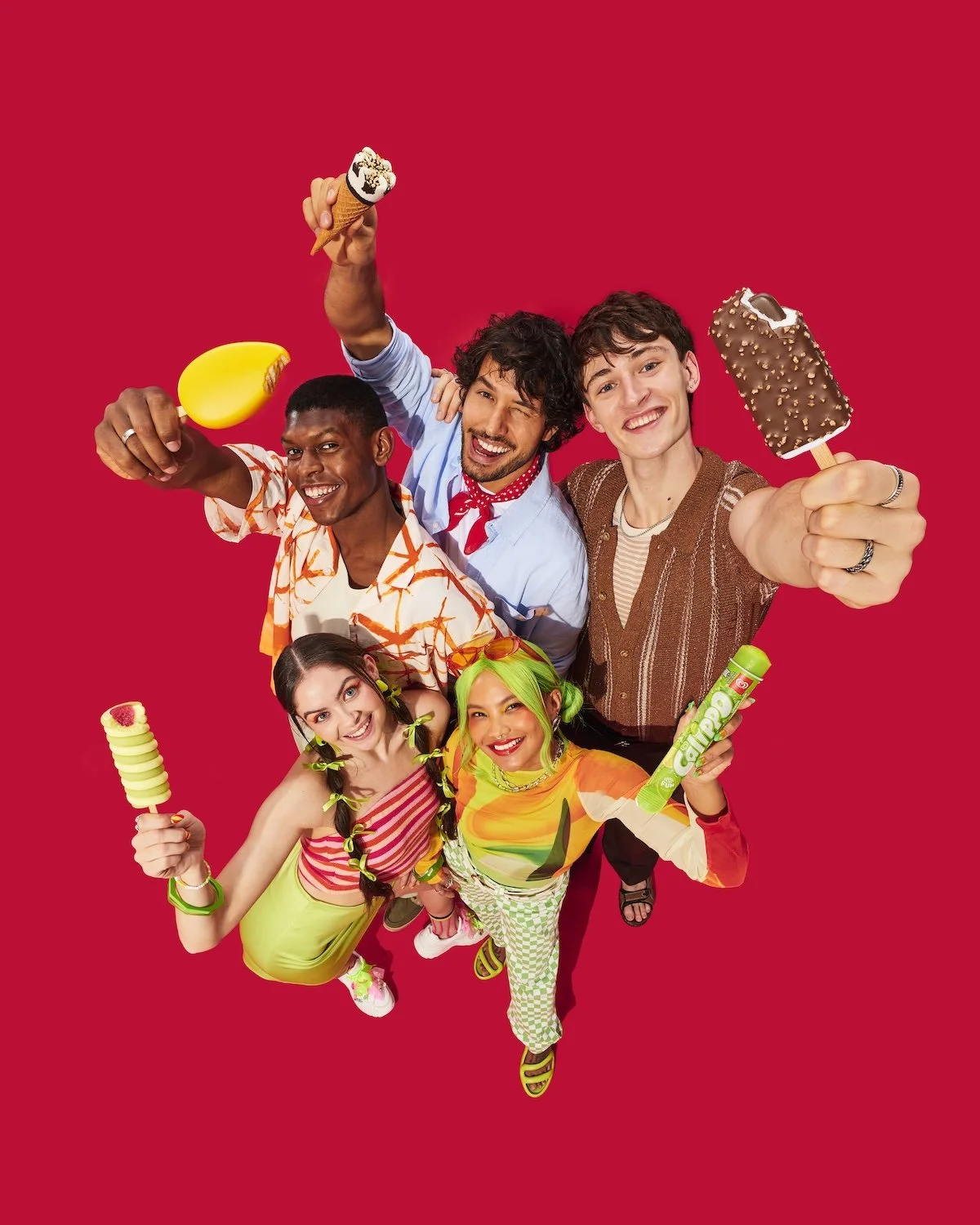

And we played with colour, texture, wardrobe and accessories, hair, makeup and some incredible nails - allowing each and every aspect of each and every image to embody the spirit of the ice cream it represents.


The project is a testament not only to creative collaboration with the talented team at Sunhouse, but also to the value of a fully integrated photographic / production approach - demonstrating how thoughtful planning, scalable image-making and meticulous execution can deliver a cohesive visual identity across a complex international campaign.
HUGE thanks to Sunhouse and Walls for this amazing commission and to our incredible team who supported us throughout the production .
🍦🙌🍦🙌🍦🙌✨